MY ROLE:
UX/UI Designer
BACKGROUND
Jobox is a mobile application for home service professionals to manage their jobs and businesses. The product started out as a simple payments app, but as it grew to a national home services marketplace, so did the need for team support and administration, and lack of team functionality became a hindrance to marketplace growth.
CHALLENGES
1. Teams are composed of multiple roles —Team Leader, Individual Technician, Back Office Personnel, Quotes, Billing, etc. These roles require specific permissions.
2. Team administration must accommodate both supply and demand specific teams, as well as teams that do both.
3. Legacy users on the mobile app must be seamlessly ushered into this new environment.
USER FLOW
Because this was a new piece of software that included onboarding and multiple entry points, I created user flows to establish the structure of the experience and how and where we would collect personal information from our users.
USER FLOW_FIGMA FILE
MVP
Our MVP to established the initial functionality of our product:
- Entry point (dashboard)
- Links to download the mobile app, finish KYC, and accept credit card payments
- Set up and edit team members
Onboarding
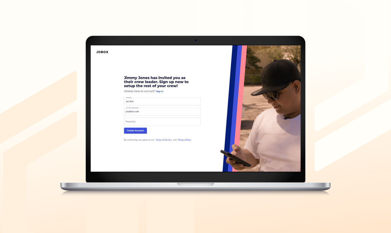
To accommodate new users, including letting team owners onto our platform for the first time, we built an onboarding process that included new registration, invitation, and KYC flows. We optimized these flows by building in role specification, field settings, and team member invitations, in addition to including links to download the mobile app and further set up options on the first page of the MVP. Initially, team owners didn’t need to do much more than set up their teams, so we kept the MVP simple, with minimal functionality.
To accommodate invitations sent to techs using the Jobox mobile app, we built a Team Invitations Acceptance mobile flow that tied together functionality of the two platforms.
TEAM INVITATIONS ACCEPTANCE_PROJECT
MUI
To speed up our development cycle, we evaluated several leading UI component libraries. We landed on MUI, which was robust but flexible enough to allow for future customizations.
Navigation Explorations
Beside the core functionality, we evaluated how the product would grow over time with explorations into the navigations system. Our long term vision was to create an environment that would work seamlessly with the mobile app, where both supply and demand partners would manage and grow their businesses with role based functionality and permissions. We called this The Shell — a framework with a navigation system flexible enough to accommodate all future use cases.
Wireframes
Our next set of explorations were done via wireframes to accommodate a fast paced, iterative process. We used these to explore our secondary navigation systems, page layouts, and interactions of the dashboard, user settings, and team admin/management pages.
We chose tab navigation as our second tier navigation system to accommodate future sections of the team management and user administration pages, utilize progressive disclosure, and delineate clearly from our primary navigation on the dashboard.
We explored how the environment would function differently based on roles by creating wireframes for both Team Owner and Field Pro views.
Project Outcome
DASHBOARD
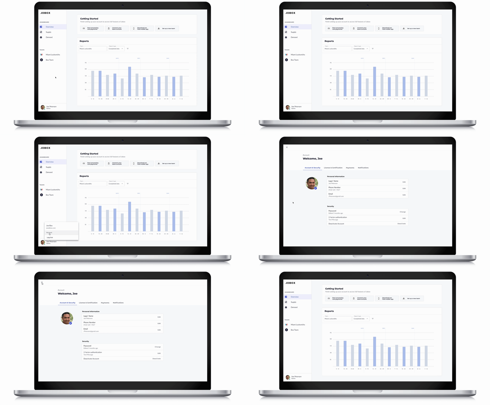
Our finalized dashboard includes links to complete onboarding, reporting across all teams, and an updated side menu. We placed team in the side menu to make it more visible/accessible. Since account settings would be accessed less frequently, we placed it in the avatar pop up menu and had it sit over the entire site to keep it delineated and contained.
ACCOUNT SETTINGS
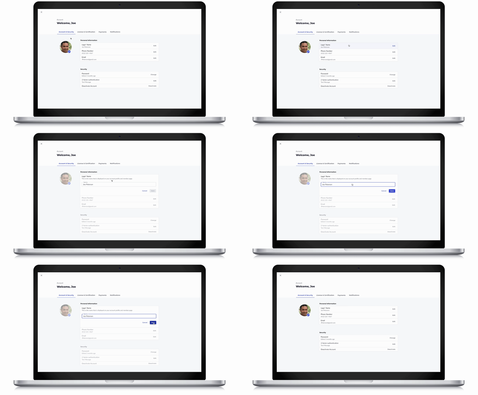
Since users are not expected to change the account settings frequently or in bulk, we made these sections expandable/collapsable to keep the interactions lightweight and efficient, progressively disclosing editable fields after the edit button is clicked. This removed the visual clutter of having all fields visible all the time. To give users context and clarity to their actions, we utilized button variants and hover states.
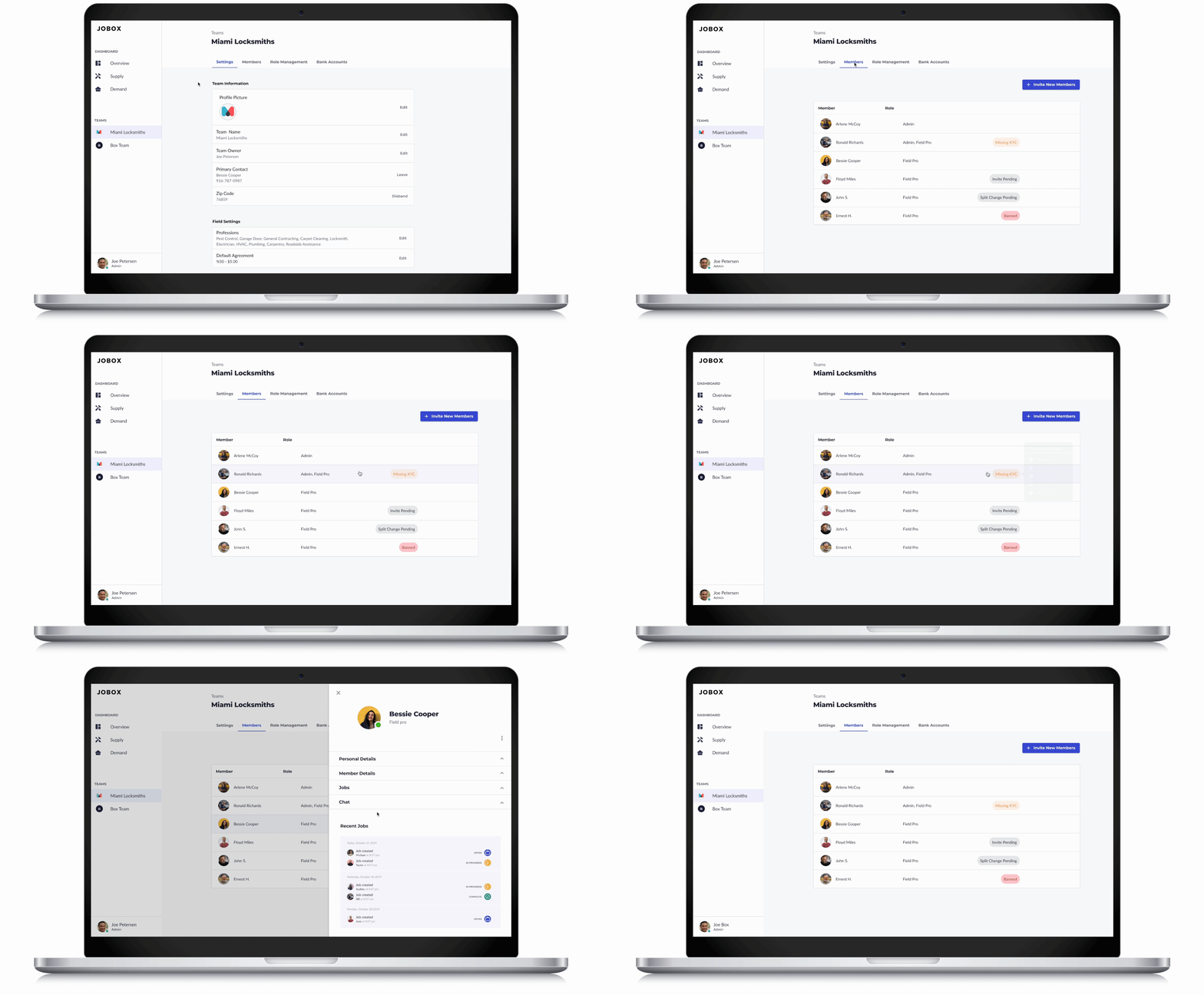
TEAM SETTINGS & MANAGEMENT
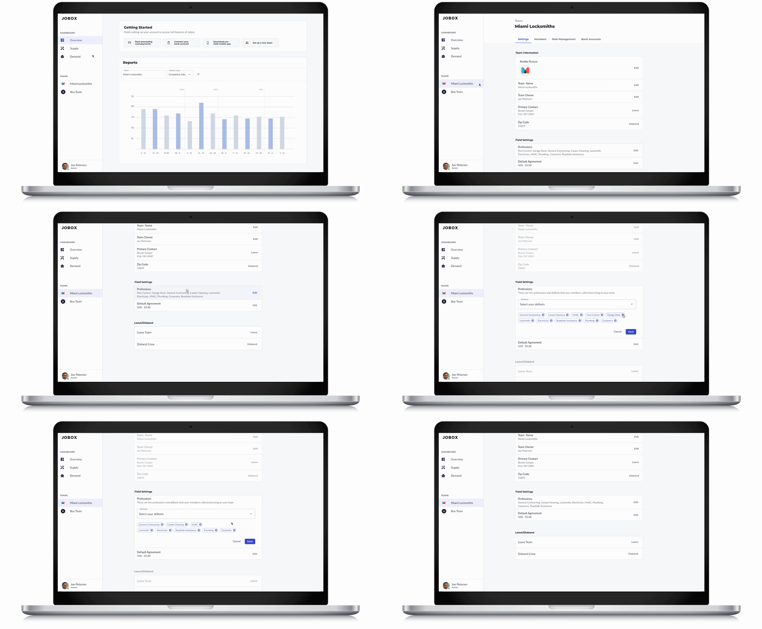
We repeated our strategies of progressive disclosure and visual feedback in the team settings section to keep our interactions consistent and efficient.
MEMBER PROFILE
We built a clickable list of members for team owners to manage their team members in one place. We included hover state pop up with onboarding information to give team owners a snapshot view of their members. For further member specific information, we built a member profile card that slides in from the right when the member’s name is clicked.

